Analyzing Music in R Using Spotify
This blogpost will show you how to do two things: analyze music by scraping data from Spotify, and visualize that data using a radar chart using ggradar.
Table of Contents
Analyzing Music in R
For this tutorial, you will need to install a few packages, most notably, spotifyr (where we will be analyzing music). A few others are also required (see below).
library(spotifyr)
library(tidyverse)
library(ggplot2)
library(ggradar)
library(scales)
Spotifyr Package
The spotifyr package is a way that you can view data from artists and songs streamed on Spotify, as well as be able to view your specific Spotify data, and analyze that if you choose to. Before being able to utilize this package, you will need to create a Spotify developer account, which you can use your normal Spotify login for, on: https://developer.spotify.com. This enables you to get access to the content within the package. Once logged in, you can “create an app,” which will give you the two pieces of information you need to access Spotify’s content: your “Client ID” and your “Client Secret.” Once you have both of these codes, you are ready to rock (stupid pun intended). It is important to use your own ID codes because they are unique to each Spotify user.
#Input your own Client ID and Client Secret where you see 'xxxx'

Sys.setenv(SPOTIFY_CLIENT_ID = 'xxxx')
Sys.setenv(SPOTIFY_CLIENT_SECRET = 'xxxx')

access_token <- get_spotify_access_token()
Getting Artist Data
For this tutorial we will be looking at some of Taylor Swift’s Spotify data. You can do this for any artist you like. Here, I am saving a dataframe into the name "tswift", and cleaning it to only include the variables I’m interested in. In this case, I’m going to look at album_name, track_title, tempo, danceability, valence and energy. Valence, energy and danceability are Spotify metrics that describe, essentially, how positive (“happy”) a song is, how lively (“intense”) it is, or (quite literally) how “danceable” it is, respectively. For example, a low valence, low energy song may be categorized as “depressing,” whereas a high energy low valence song would be more “angry.” In contrast, a song with high valence and high energy would be cheerful and upbeat. Spotify has other ways in which they analyze their songs, but for the purpose of this tutorial, I think these items do a good job of capturing a song’s individual essence, or “vibe”, if you will.
To make sure my plots are not tainted by duplicate tracks or albums (many artists re-record songs as remixed or live versions), I will select only the albums I’m interested in. Additionally, as a Taylor Swift fan, I will include the (Taylor’s Version) over the original when possible. For simplicity, I am only including her nine official studio albums.
To get an artist’s data, use the get_artist_audio_features function.
tswift <- get_artist_audio_features("Taylor Swift")

tswift.clean <- tswift %>%
  filter(album_name %in% c("Taylor Swift", "Fearless (Taylor's Version)", "Speak Now", "Red (Taylor's Version)", "1989", "reputation", "Lover", "folklore", "evermore")) %>%
  select("album_name", "track_name", "danceability", "valence", "energy", "tempo")
Radar Plot
Now, for the fun stuff. We will be making a radar chart comparing the valences, energy, danceability and tempos of each album. Radar charts are cool because you are able to compare multiple variables across factors, in a very intuitive way. Before we get to graphing, I first have to make the data a little more “radar friendly.” This means having to rescale our variables on a [0, 1] interval. As you might notice, the radar plots are set up to show percentages 0-100%. Hence, we need to rescale our variables to be in between 0 and 1. This is also useful because some of our variables are scaled differently. Now, we are able to compare them on a level playing field. Setting up different minimums and maximums are also possible, but for this particular example, we will stick to rescaling on a [0, 1] interval.
First, I get the means of each variable of interest. Then, I rescale using the rescale function from the scales package. Once I have my variables on a [0, 1] interval, we are ready to plot. We simply plug our "tswift.radar" object into ggradar().
tswift.radar <- tswift.clean %>%
    group_by(album_name) %>%
  summarize(
    valence = mean(valence),
    energy = mean(energy),
    danceability = mean(danceability),
    tempo = mean(tempo)) %>%
  ungroup() %>% #we ungroup here since we grouped by album before
  mutate_at(vars(-album_name), rescale) #this rescales all of our variables (except album_name) on a [0, 1] interval
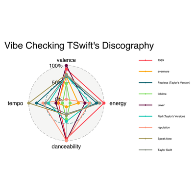
After plugging in our tswift.radar object to ggradar, we get this lovely radar chart. I toggled with some of the graph settings, because the legend came out extremely large and wonky. Check out my comments below for more explanation on how I did that.
As we can see below, this radar chart is a pretty good representation of what we are looking for. What we are looking for, I guess, is essentially a vibe check (consider our chosen variables, and tell me how that isn’t a vibe check). Although there is a lot going on in the graph, it is easy to separate when you’re searching by specific album, or looking at a specific variable. Take for instance, danceability. Here, we see that “Lover,” “reputation,” and “1989” rank the highest. When it comes to valence (measuring how “happy” the songs are), we can see that “reputation” has the lowest score, followed by “folklore.” “Lover” has the highest valence (which, if you are a Swiftie, makes sense considering it’s literally an album about her being in love). When it comes to tempo, “Speak Now” by far has the highest average tempo, whereas “folklore” crawls along at a snail’s pace, in comparison.
#I made some additional specifications to make a prettier chart
swiftradar <- ggradar(tswift.radar,
        legend.position = "right", #puts the legend on the right, but you can also choose "left", "top" or "bottom"
        group.line.width = 1, group.point.size = 3, legend.text.size = 7,  plot.title = "Vibe Checking TSwift's Discography") + #changes our line and point thickness on theplot and legend text size
  guides(shape = guide_legend(override.aes = list(size = 1)),
         color = guide_legend(override.aes = list(size = 1))) #here, I override settings to make the legend element sizes smaller

#saving my plot! You can replace with .jpeg, .pdf and more
ggsave("swiftradar.png")
Changing Colors on Radar Plots
I am adding in this bit because after showing my sister my beautiful radar chart, she complained that the colors did not correspond to Taylor Swift’s “color eras” in real life. For the uninitiated, each album has an associated color. Thus, I will try my best to accommodate and provide some instruction on how to change the line colors. These instructions are also useful because they can be generally applicable to a wide variety of ggplot situations.
Changing the colors is pretty easy. Essentially, we make a vector of our chosen color names, and then add it to the group.colours argument. The spelling of “colours” here is very important, it won’t work otherwise. For my colors, I am using hexcode color options, but you can just as well write “blue” or “green.” Hexcodes give you more options, and you can simply google the hexcode for whichever color you are looking for. Don’t forget to put parantheses around your hexcode colors, otherwise it won’t work (R will think it’s a comment and not code).
#Creating a color vector
colors <- c("#816477", "#386F43", "#e0af6b", "#99A3A4", "#F085CC", "#E74C3C", "#333333", "#8E44AD", "#50a7e0")

#Just copied and pasted the same code
swiftradarcolor <-  ggradar(tswift.radar,
        legend.position = "right",
        group.line.width = 1, group.point.size = 3, legend.text.size = 7,  plot.title = "Vibe Checking TSwift's Discography",
        group.colours = colors) + #I inputted our color vector as the group colors NOTE: it only works with the British spelling for some reason
  guides(shape = guide_legend(override.aes = list(size = 1)),
         color = guide_legend(override.aes = list(size = 1)))

#saving plot
ggsave("swiftradarcolor.png")
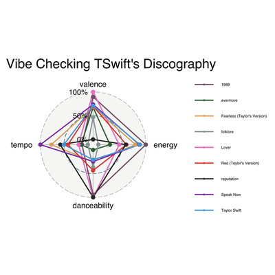
And there we have the updated radar chart, using proper colors this time! I personally think the first one is easier to read, but I know better than to make Taylor Swift fans angry on the internet.
Analyzing Lyrics With tidytext and wordcloud
For this portion of the tutorial, we will need a few more packages (see below). tidytext is a package that lets you analyze the text or words of your dataset. There used to be a package that allowed you to scrape the lyrics of songs to be used in conjunction with the spotifyr pacakge, but last month they discontinued it because of a grey area concerning copyrighting (ugh, stupid laws!). To my knowledge, there isn’t a comparable package yet, so this tutorial will be more about learning a few ins and outs for the tidytext package. I will be using a dataset from github user Simran Vatsa, where she has compiled Taylor Swift lyrics (her first 6 albums) with corresponding tracks and albums in a data set. If you’re interesting in practicing with this data set, here is the link where you can access it: https://github.com/simranvatsa/tayloR. Another fun package for textual analysis is Julia Silge’s janeaustenr package, with Austen’s complete works. Anyways, first things first, we get our data nice and tidy. We’ve already analyzed Taylor’s music, so I’m only interested in track_name, lyrics, and album_name.
library (readr)
library(here)
library(tidytext)
library(wordcloud)
library(kableExtra)
library(tayloRswift)

lyrics <- read_csv(here("taylor_with_lyrics.csv"))

cleanlyrics <- lyrics %>%
  select("track_name", "lyrics", "album_name")
Wordcloud
After tidying our text, we can make a fun visualization in wordcloud. Basically, we are counting up the amount of words Taylor uses, and gathering the most used ones in a visualization of actual words. In order to do this, we will need to create a dataframe with a single column with one word in each row using tidytext.
Tokens (not the arcade kind)
tidytext refers to words as tokens, so we need to “unnest” them using the unnest_tokens function, followed by the argument word and our column of interest, lyrics. This creates a column aptly named word that pulls the individual words out of our lyrics column, and places each single word on it’s own row. You will end up with a sh**load of rows. Like, a lot. Then, we count our tokens with the dplyr count() function. Let me show you what I mean:
#Unnest those tokens! Token-nesting begone!
tokens <- cleanlyrics %>%
  select("lyrics", "album_name") %>%
  unnest_tokens(word, "lyrics")


#Let's count these bad boys up. Don't forget to ungroup at the end.
cleantokens <- tokens %>%
  count(word, sort = TRUE) %>%
  ungroup()
Get Rid of Words You Don’t Need
After taking a peek at your tokens, you may notice that there are a lot of words that we aren’t really interested in. After all, who cares about words such as “I” or “it” or “and”?
Luckily, tidytext has a stop_words dataset within it with many common words from the English language. A simple anti_join from dplyr paired with stop_words from tidytext will see if any words from our tokens dataframe match the stop_words dataframe, and it’ll remove them. Let’s plug ‘er in and see what we get.
#these stop words are NOT allowed to join our party!
cleantokens <-  cleantokens %>%
  anti_join(stop_words)
Visualizing the Wordcloud
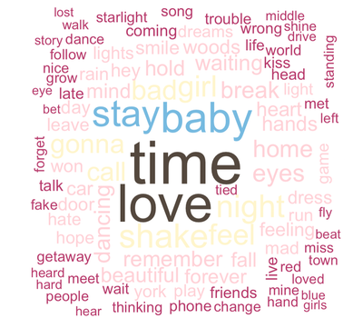
Now that our words exclude common words, let’s get on to making that wordcloud! For this wordcloud, I am going to (aptly) use the tayloRswift color palette package (of course). Let’s make a wordcloud of her overall word usage from her first seven albums.
#Taylor Swift's word usage in total, using 100 words
cleantokens %>%
  with(wordcloud(word, n, random.order = FALSE, max.words = 100,
  colors = c(swift_palettes$lover))) #drawing from the tayloRswift color palettes
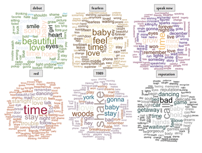
So now we know how to visualize text using wordcloud. Unfortunately, it’s not easy to save these as an image without knitting your document first, and there’s no simple way to facet several word clouds together in a way that’s simple. Just for fun, I created a graphic analyzing Taylor Swift’s lyrics per album, just by individually saving each image after knitting. The code is still useful, however, because I also created some custom color palettes.
Making Wordclouds Per Album
We start the same way we did before, this time saving an object titled with each respective album and count the words. Our tokens dataframe is already unnested and tokenized, so we are good to go. All we have to do is filter by album_name. I’ll just include the first album here, because the code is the same for all of the rest of the albums.
debut <- tokens %>%
  filter(album_name == "Taylor Swift") %>%
  count(word, sort = TRUE) %>%
  ungroup()
Creating the Clouds
I was not completely happy with the tayloRswift color palettes, as some of the colors were so light that they were invisible. Also, as a Swift fan, I disagreed with some of the color choices (no shade!). So I modified them. This is exactly how we modified the radar chart’s color lines. We make a vector with the colors we’d like in the palette.
Creating a Custom Color Palette
#the speakNow color palette had too many white colors, so I modified:
speaknowpalette <- c("#813c60" , "#4b2671", "#5e291c", "#f3d8c4", "#f3bf73")

#Okay, I am shooketh...the tayloRswift "Red" palette didn't include red! Modified:
red4reals <- c("#b1532a", "#84697f", "#cbb593", "#a88f92", "#e8eadf", "#a02b48")

#the 1989 palette looked too much like Speak Now, so I made a few changes:
color1989 <- c("#84697f",  "#a85d36", "#816477", "#366e84", "#875336", "#e8eadf","#a88f92", "#b15357", "#b0a19d")

#There were too many white colors, so I customized it:
repcolor <- c("#060606", "#6e6e6e", "#2f4f4f", "#cacaca", "#060606", "#8c8c8c")
Cloudin’ Around
Finally, our code for each specific word cloud/album. I only included the first three here, because you get the idea. But I did this for all the albums.
wordcloud <- debut %>%
  with(wordcloud(word, n, random.order = FALSE, max.words = 100,
  colors = c(swift_palettes$taylorSwift))) #using the tayloRswift package corresponding palettes for each album!

wordcloud <- fearless %>%
  with(wordcloud(word, n, random.order = FALSE, max.words = 100,
  colors = c(swift_palettes$fearless)))

wordcloud <- speaknow %>%
  with(wordcloud(word, n, random.order = FALSE, max.words = 100,
  colors = speaknowpalette))
Finished Product
Again, there was no way to facet this in R using the wordcloud package, so this is a simple screen shot with some labels added. When I become a better programmer, I’m sure there’s a way to hack this (let me know if you know!), but this is the best I’ve got for now. Regardless, it’s fun to compare the album lyrics, especially with the valence data. All in all, a cool way to represent textual data!
The End
In sum, we learned how to use the spotifyr package, how to interpret Spotify’s elements of musical measurement, and how to plot those elements into a radar chart using ggplot2. We also learned how to clean textual data using tidytext, plot a wordcloud using wordcloud, and how to customize a color palette. There are many other ways to visualize the data within the spotifyr package, and many uses within tidytext, but these were just a few. Tweet me your comments or suggestions for more tutorials!
Nini Longoria (Anna Maree)
MSc Social Psychology Student
My research interests include sexual satisfaction, sexual identities, sexual desire, gender, feminism and intimate relationships.