Animating Plots in R
Animating Plots
For this tutorial, we will continue using the spotifyr package to generate some cool data. This time, we will be looking at another artist, Incubus. We are going to explore how their their states of valence have changed across albums (that’s where the animation kicks in). We will need the following packages:
library(spotifyr)
library(tidyverse)
library(ggplot2)
library(gganimate)
We begin the same way we did for the last tutorial, except our artist of interest this time is Incubus. Incubus is a fantastic band to analyze, because they have 10 years worth of albums to work with. Again, we will select only relevant albums (their 8 studio albums, not including live versions or re-records). This time, we will select more information such as musical key and mode, and album release year. Here we go.
incubus <- get_artist_audio_features("Incubus")

#tidy things up a bit, and rename my variables so they look pretty on my plot
tidycubus <- incubus %>%
  filter(album_name %in% c("Enjoy Incubus", "S.C.I.E.N.C.E.", "Make Yourself", "Morning View", "A Crow Left Of The Murder...", "Light Grenades", "If Not Now, When?", "8")) %>%
  select("album_name", "track_name", "danceability", "valence", "energy", "tempo", "album_release_year", "key_mode", "mode_name", "key_name", "album_release_date") %>%
  rename(Album = album_name, Valence = valence, Energy = energy, Mode = mode_name, Key = key_name)
Now that we have our data tidied up, we can start visualizing the plots we would like to make.
Static Plot Using ggplot2
Before we get to animating, we will create a static version of the information we are trying to visualize. I don’t want to overcrowd our plot, so faceting should take care of this (faceting lets us create different smaller plots as a part of one larger plot).
Our Variables
For this plot, let’s take a look at valence and energy, which are variables that we are familiar with from the previous blog post. As a reminder, Spotify’s valence score (between 0 and 1) is how positive (happy) a song is. The more valence, the happier the song. The less valence a song has, the more likely it is to appear on a breakup playlist, par example.
Spotify’s energy scores (between 0 and 1) measure how much activity (how lively) is in a particular song. Energy also measures tempo and loudness (in decibels). High energy songs have a lot goin' on, think Hot Topic in the 90’s. Low energy songs are what grandma plays before going to bed.
Plotting
Enough pretense, let’s plot. Let’s take a look at valence and energy, faceted by album name. For fun, let’s also look at key mode by making the size of each point bubble it’s key mode name. Key mode indicates whether a song is in a major or a minor key. In this case, the larger bubbles indicate a minor key, whereas the smaller bubbles indicate a major key.
staticcubus <- ggplot(data = tidycubus, aes(x = Valence, y = Energy, color = Album, size = Mode)) +
  geom_point(alpha = .3) +
  geom_jitter(alpha = .3)+
  facet_wrap(vars(Album)) +
  labs(title = "Valence, Energy and Keys Across Incubus Albums")

#saving our plot
ggsave("staticcubus.png")
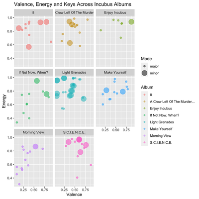
I like this plot because it dispels the myth that sad songs have to be in a minor key. If you look at the album “Enjoy Incubus,” you can see the highest valence song is in a minor key. “If Not Now, When?” (my favorite album), has high valence songs in a minor key, and notably, has some pretty depressing (low valence) songs all in a major key. Here, we can also eyeball what their most depressing/happiest albums might be. From the looks of it, “Morning View” and “Light Grenades” look pretty damn depressing, whereas “S.C.I.E.N.C.E.” looks pretty cheerful. To double check this, you can simply take the mean valence of each album and compare them, like I did in the last tutorial with Taylor Swift’s discography. (Also, I checked the means behind the scenes…and I was right! This indicates that our plot reads well in terms of “eyeballing!")
gganimate
Okay, let’s get to the juice. Animating seems scary, but it’s actually pretty easy. I’m an R beginner, and if I can do it, so can you. For this plot, I will animate my variables across time.
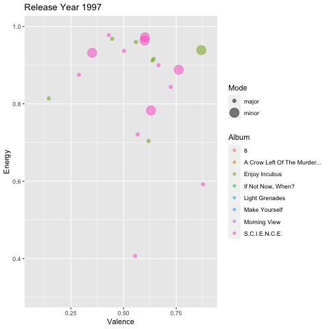
transition_time
I’m going to use the transition_time function, and animate my plot by album_release_year.
But wait! Why doesn’t our plot look the same as our static plot? Why isn’t it faceted?! Has the world gone mad?!
No. Our plot may not be faceted, but it actually tells us the same information all in one plot. Nice.
Because I am animating by year, the plot points corresponding to each album only appear in their appropriate year. Because all the plot points will not be on the plot at the same time, it won’t be overcrowded. In this plot, the animation replaces the use we had for faceting our static plot. It’s the same code as our faceted plot, minus the facet_wrap.
As you can see, animating is showing us the exact same information, all in one plot this time. Why use many plot when few plot do trick? (The Office reference. Scroll on by if you don’t get it).
#Static plot information without the faceting. There's two new lines of code: transition_time, and me labeling the transition time.
animtimeplot <- ggplot(data = tidycubus, aes(x = Valence, y = Energy, color = Album, size = Mode)) +
  geom_point(alpha = .3) +
  geom_jitter(alpha = .3)+
  labs(title = "Comparing Valence, Energy and Key Modes for Incubus Albums")+
  transition_time(album_release_year)+
  labs(title = "Release Year {frame_time}") #this makes the year appear in the title like a running clock

#we plug our object into the animate function. I added an "end_pause" argument, which means that there will be a pause at the end of the animation before it loops back to the beginning again.
animate(animtimeplot, end_pause = 30)
anim_save("animtimeplot.gif")
Other Animation Effects
Our previous plot shows the default animation style in gganimate, using time as a transition in the animation with the transition_time function. There are a few other cool effects and transition types that you can play with, depending on your data and what might make the most sense. I’ll show you a few here.
transition_states
We used transition_time to animate the previous plot, which let us view our data points through time. Other variables like age or temperature would be good contenders for the transition_time function.
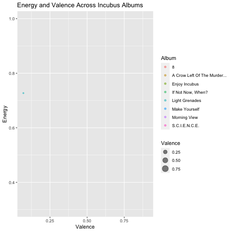
It is also possible to animate our graphs using the transition_states function. This animates our graph and takes us through the different “states” of our choosing. All we have to do is choose a variable. For these examples, I’ll let our state be Valence. Now, our plot will be animated and show us our data points animated according to Valence (least to highest). For this plot, I removed key mode, and instead the size of each bubble represents higher (larger bubbles) or lower (smaller bubbles) valence.
This plot overall may be less informative for differentiating each album through states of valence, but it can let us see the types of songs Incubus tends to write in terms of valence and energy.
For example, these graphs can help us answer this question: Accross albums, does Incubus tend to write their sadder songs (valence) in a more energetic/lively way (energy)? Or are their sadder songs slower and more ambient?
#transition_states = Valence
states <- ggplot(data = tidycubus, aes(x = Valence, y = Energy, color = Album, size = Valence)) + #I changed the size to Valence
  geom_point(alpha = .3) +
  geom_jitter(alpha = .3)+
  transition_states(Valence) + #Our data points are now journeying through Valence instead of time
  labs(title = "Energy and Valence Across Incubus Albums")

#animating and saving
animate(states)
anim_save("states.gif")

It looks like most of their lower valence songs tend to have energy above the 0.5 mark. This makes sense, as they write a lot of rock songs.
Shadow Functions
There are some effects we can give our datapoints as well, as they travel through the Valence state. Some effects I really like are shadow effects. Essentially, this gives our data points “shadows” and, in my opinion, make the data a little easier to read as the points linger a bit and shrink before moving on, depending on the type of shadow used. Note: using shadow functions are only helpful up to a certain point. If you have a large number of data points, using shadow functions could obscure your data.
shadow_wake
The plot below is exactly the same as our plot above, only I have applied the shadow_wake function. This function requires the wake_length argument, which tells R how long you want each data points “shadow” (or “wake”) to be.
shadowwake <- ggplot(data = tidycubus, aes(x = Valence, y = Energy, color = Album, size = Valence)) +
  geom_point(alpha = .3) +
  geom_jitter(alpha = .3)+
  transition_states(Valence) +
  shadow_wake(wake_length = 0.5) + #this is a good wake_length, you can always make it longer or shorter depending on your preferences
  labs(title = "Energy and Valence Across Incubus Albums")

animate(shadowwake)
anim_save("shadowwake.gif")
shadow_trail
This shadow function is one of my favorites. shadow_trail traces datapoint movement, but after appearing, our data points remain on the plot instead of disappearing, leaving us a data breadcrumb trail. I think using shadow_trail can also be especially intuitive when using the transition_time function, as it gives the viewer more time to interpret the graph before the points disappear. The shadow_trail function requires a distance argument, which represents the temporal distance between frames you’d like to show.
shadowtrail <- ggplot(data = tidycubus, aes(x = Valence, y = Energy, color = Album, size = Valence)) +
  geom_point(alpha = .3) +
  geom_jitter(alpha = .3)+
  transition_states(Valence) +
  shadow_trail(distance = 0.07) +
  labs(title = "Energy and Valence Across Incubus Albums")

animate(shadowtrail)
anim_save("shadowtrail.gif")
transition_filter
Another interesting way to visualize your data using animation is to subset your data. Here, I can create subsets of a certain variable, name them, give them a value, and then display it in my plot. For this plot, I will subset the Valence variable. I will create two categories: high and low valence. Our plot will transition to showcase each subset, one at a time, using the transition_filter function. For the arguments, I will tell R what each subset is called, and assign them a value. Our subtitle will also be animated, and switch between our subsets and our data points will follow. Be sure to add a subtitle, and the {closest_filter} argument so that R can automatically add your subset titles to your subtitle. transition_filter could be a really neat tool to use if you have several variable subsets you are trying to visualize.
subset <- ggplot(data = tidycubus, aes(x = Valence, y = Energy, color = Album, size = Valence)) +
  geom_point(alpha = .3) +
  geom_jitter(alpha = .3)+
  transition_filter("Low Valence" = Valence <= 0.25,
                    "High Valence" = Valence >= 0.5) + #assigning subset names to values
  labs(title = "Energy and Valence Across Incubus Albums",
       subtitle = "Subset of {closest_filter}") #adding a subtitle so that viewers understand the transition phase

animate(subset)
anim_save("subset.gif")
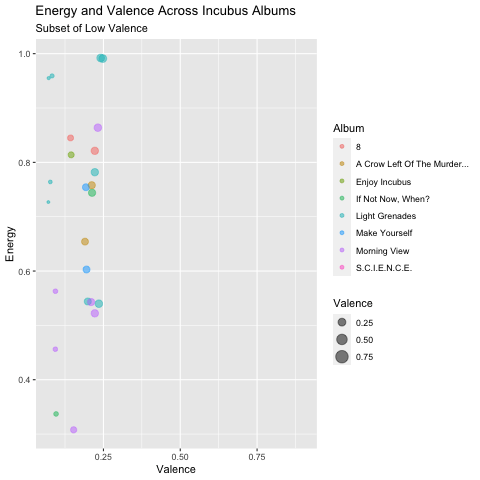
Okay, that is pretty cool, but there may be a better way to organize this specific plot.
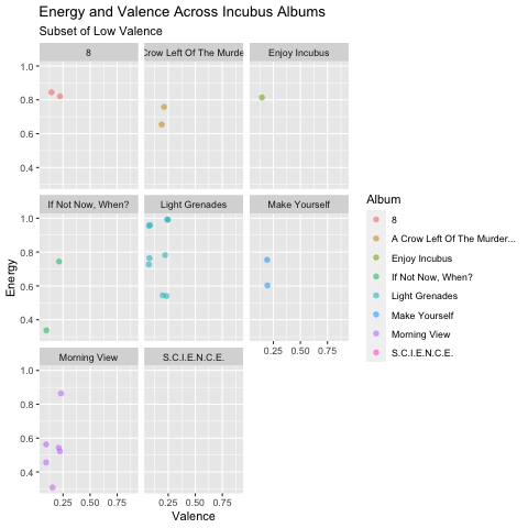
Back to the facet!
Faceting this plot makes it easier to see how many tracks are low valence, and how many are high valence, across all albums. Overall, it looks like Incubus has a pretty even amount of low to high valence songs, but we can see the distribution per album a little better. I made the size of all the bubble points uniform again (I got rid of using bubble size as amount of valence) so that we could better see the distribution. For example, we see that almost all of the songs on “Morning View” have a low valence, except for two. The opposite of this occurs for “A Crow Left Of The Murder…”.
animfacet <- ggplot(data = tidycubus, aes(x = Valence, y = Energy, color = Album)) +
  geom_point(alpha = .3, size =2) +
  geom_jitter(alpha = .3)+
  facet_wrap(vars(Album)) +
  transition_filter("Low Valence" = Valence <= 0.25,
                    "High Valence" = Valence >= 0.5) +
  labs(title = "Energy and Valence Across Incubus Albums",
       subtitle = "Subset of {closest_filter}")

anim_save("animfacet.gif")
The End
To conclude, today we learned how to animate a plot using transition_time and transition_states, use two different shadow functions: shadow_wake and shadow_trail, and how to animate plot subsets using transition_filter. These are just a few, but there are so many more fun ways to use gganimate to bring your plots to life! Let me know if you have any questions or tutorial requests!
Nini Longoria (Anna Maree)
MSc Social Psychology Student
My research interests include sexual satisfaction, sexual identities, sexual desire, gender, feminism and intimate relationships.